什么是路徑動畫?
隨手畫一條不規則的線,讓元素按照這條不規則的線運動起來,這就是所謂的路徑動畫。
前面說過的動畫都只能針對某一個 CSS 屬性,要想實現路徑動畫可沒辦法,路徑動畫必須借助 CSS3 的 offset 相關能力。
offset 相關屬性
要實現路徑動畫,必須用到 offset 的相關屬性:
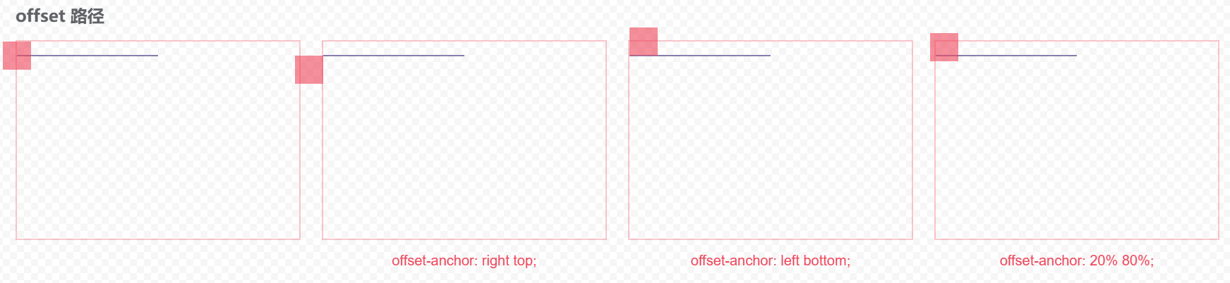
offset-anchor 指定元素的運動中心在哪個點上,默認是元素中心點。
offset-distance 指定元素沿路徑的運動距離,100% 表示路徑總長度。
offset-rotate 設置元素沿路徑方向的旋轉角度。
offset-position 定義元素沿路徑的初始位置。
offset-path 指定元素運動路徑。
offset 簡寫屬性,包括以上所有屬性。
offset-anchor
設置中心的位置:
offset-distance
設置元素在這個路徑中的運動距離:

offset-rotate
設置元素在路徑上的旋轉角度:
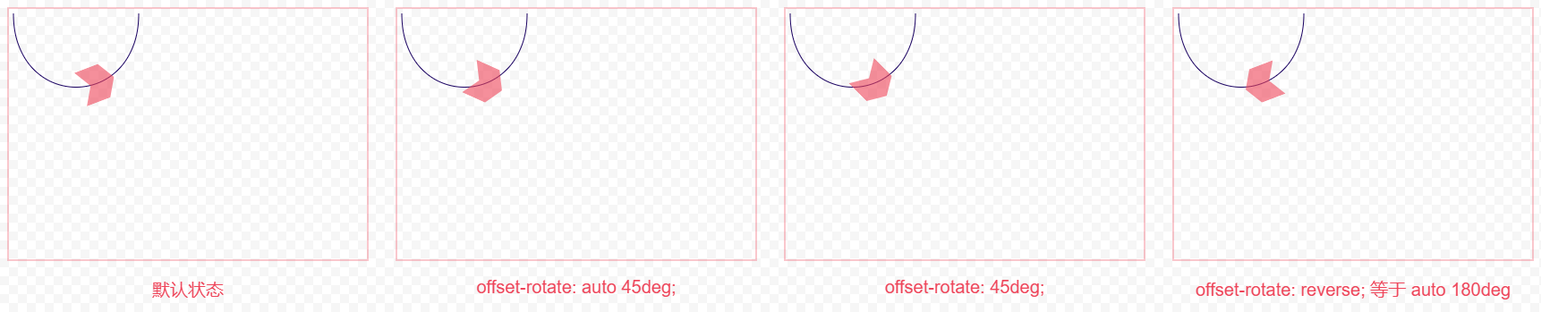
其中第一個 auto 表示讓瀏覽器自己計算角度,第二個角度值表示在計算出來的角度基礎上再旋轉多少度。
offset-position
說實話,沒搞懂這屬性的用法,雖然案例看起來屬性值是有效的,但沒理解到它的實際生效規則。
按照 w3c 的規范說法:如果 offset-path 屬性使用的函數未指定起始位置時,則使用 offset-position 屬性指定的起始位置。
看下圖,雖然元素的位置變化了,但是路徑動畫的運動距離也跟著變化了!!真是沒搞懂...
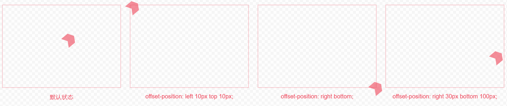
以上圖片的代碼:
<div class="container">
<div class="box">
<div class="item"></div>
</div>
<div class="box">
<div class="item"></div>
</div>
<div class="box">
<div class="item"></div>
</div>
<div class="box">
<div class="item"></div>
</div>
</div>
<style>
.box {
margin: 20px 0;
width: 400px;
height: 280px;
border: 2px solid rgba(255, 71, 87,0.3);
position: relative;
}
@keyframes offset-ani {
0% {
offset-distance: 0%;
}
100% {
offset-distance: 100%;
}
}
.item {
offset-path: ray(50deg);
animation: offset-ani 2s infinite alternate ease-in-out;
width: 40px;
height: 40px;
background-color: rgba(255, 71, 87,0.6);
clip-path: polygon(0% 0%, 70% 0%, 100% 50%, 70% 100%, 0% 100%, 30% 50%);
}
.box:nth-child(2) .item {
offset-position: left 10px top 10px;
}
.box:nth-child(3) .item {
offset-position: right bottom;
}
.box:nth-child(4) .item {
offset-position: right 30px bottom 100px;
}
</style>
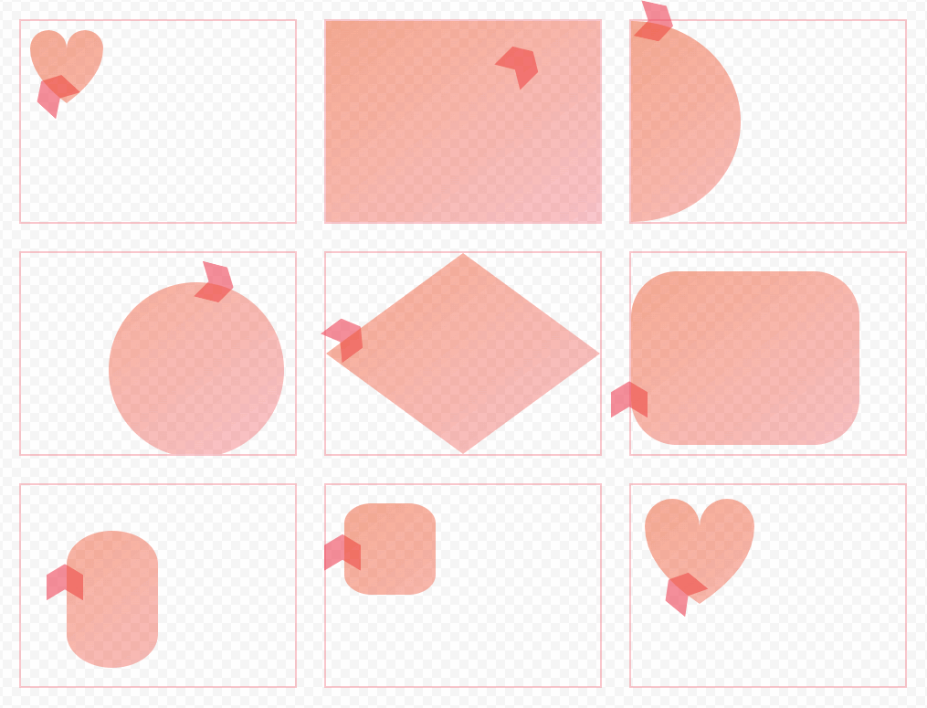
offset-path 指定元素運動路徑
url() 指定 SVG 形狀元素的 ID,用法 offset-path: url(#myCircle)。
ray() 線段。用這東東還不如使用 transform 位移。
circle() 圓形,用法:circle(6rem at 12rem 8rem),表示:圓形,半徑為 6rem,圓心為 12rem 8rem。
ellipse() 橢圓,用法 ellipse(40% 50% at left)。表示:橢圓,長軸為 40%,短軸為 50%,圓心為左邊。
polygon() 多邊形,語法 polygon(x1 y1, x2 y2, x3 y3, ...)
inset() 內嵌矩形,用法 inset(20px 50px 10px 0 round 50px)。表示:20px 50px 10px 0 分別表示上右下左的距離,圓角為 50px。
rect() 矩形,用法 rect(50px 150px 200px 50px round 20%)。表示:矩形上邊在 50px,右邊在 150px,下邊在 200px,左邊在 50px,圓角為 20%。
xywh() 矩形,用法 xywh(20px 20px 100% 100% round 10%)。表示:矩形從 20px 20px 開始,寬高為 100%,圓角為 10%。
path() 路徑,最為強大的一個東東,復雜的路徑動畫都需要使用它。
各種路徑動畫:
上圖源碼:
<svg class="defs" style="width: 0;height: 0;position: absolute;">
<defs>
<clipPath id="myClip">
<path id="myClipAni" d="M10,30 A20,20,0,0,1,50,30 A20,20,0,0,1,90,30 Q90,60,50,90 Q10,60,10,30 Z" />
</clipPath>
</defs>
</svg>
<div class="container">
<div class="box">
<div class="item"></div>
<div class="bg"></div>
</div>
<div class="box">
<div class="item"></div>
<div class="bg"></div>
</div>
<div class="box">
<div class="item"></div>
<div class="bg"></div>
</div>
<div class="box">
<div class="item"></div>
<div class="bg"></div>
</div>
<div class="box">
<div class="item"></div>
<div class="bg"></div>
</div>
<div class="box">
<div class="item"></div>
<div class="bg"></div>
</div>
<div class="box">
<div class="item"></div>
<div class="bg"></div>
</div>
<div class="box">
<div class="item"></div>
<div class="bg"></div>
</div>
<div class="box">
<div class="item"></div>
<div class="bg"></div>
</div>
</div>
<style>
.box {
width: 300px;
height: 220px;
border: 2px solid rgba(255, 71, 87, 0.3);
position: relative;
}
.bg,
.svg {
position: absolute;
left: 0;
top: 0;
}
.bg {
width: 100%;
height: 100%;
background: linear-gradient(to bottom right, #ff56227e, #ff475650);
}
@keyframes offset-ani {
0% {
offset-distance: 0%;
}
100% {
offset-distance: 100%;
}
}
.item {
animation: offset-ani 2s infinite alternate ease-in-out;
width: 40px;
height: 40px;
background-color: rgba(255, 71, 87,0.6);
clip-path: polygon(0% 0%, 70% 0%, 100% 50%, 70% 100%, 0% 100%, 30% 50%);
}
.box:nth-child(1) .bg {
clip-path: url("#myClip");
}
.box:nth-child(2) .bg {
clip-path: ray(45deg);
}
.box:nth-child(3) .bg {
clip-path: ellipse(40% 50% at left);
}
.box:nth-child(4) .bg {
clip-path: circle(6rem at 12rem 8rem);
}
.box:nth-child(5) .bg {
clip-path: polygon(50% 0%, 100% 50%, 50% 100%, 0% 50%);
}
.box:nth-child(6) .bg {
clip-path: inset(20px 50px 10px 0 round 50px);
}
.box:nth-child(7) .bg {
clip-path: rect(50px 150px 200px 50px round 20%);
}
.box:nth-child(8) .bg {
clip-path: xywh(20px 20px 100px 100px round 10%);
}
.box:nth-child(9) .bg {
clip-path: path("M15,45 A30,30,0,0,1,75,45 A30,30,0,0,1,135,45 Q135,90,75,130 Q15,90,15,45 Z");
}
.box:nth-child(1) .item {
offset-path: url("#myClipAni");
}
.box:nth-child(2) .item {
offset-path: ray(45deg);
}
.box:nth-child(3) .item {
offset-path: ellipse(40% 50% at left);
}
.box:nth-child(4) .item {
offset-path: circle(6rem at 12rem 8rem);
}
.box:nth-child(5) .item {
offset-path: polygon(50% 0%, 100% 50%, 50% 100%, 0% 50%);
}
.box:nth-child(6) .item {
offset-path: inset(20px 50px 10px 0 round 50px);
}
.box:nth-child(7) .item {
offset-path: rect(50px 150px 200px 50px round 20%);
}
.box:nth-child(8) .item {
offset-path: xywh(20px 20px 100px 100px round 10%);
}
.box:nth-child(9) .item {
offset-path: path("M15,45 A30,30,0,0,1,75,45 A30,30,0,0,1,135,45 Q135,90,75,130 Q15,90,15,45 Z");
}
</style>
路徑
這里說到的路徑,使用到了 SVG 里面的相關知識,SVG 用于繪制矢量圖形。
什么是矢量圖形?矢量圖形是由線條組成的圖形,而不是由像素組成的圖形,所以矢量圖形在放大時,不會出現鋸齒,也不會失真。
繪制一條復雜的路徑
這里推薦一個網站:https://www.photopea.com/
此網站完全就是 PS 的在線版本,直接瀏覽器打開即可使用。
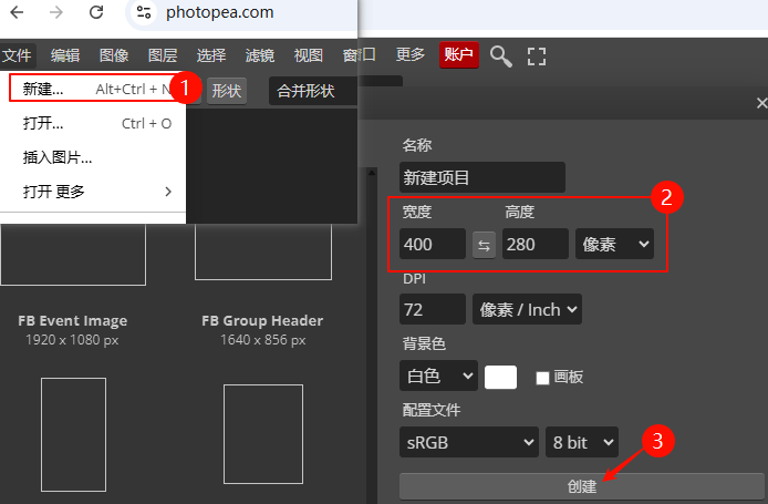
1、進入網站之后點擊 Start using Photopea 開始使用。
2、有一個隱私選擇,直接 同意并繼續 即可,如果擔心隱私問題,可以使用瀏覽器的 無痕模式 打開。
3、新建一個畫布。
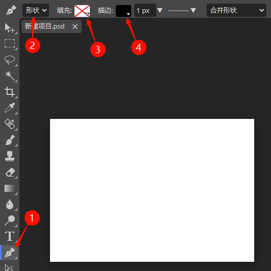
4、使用鋼筆工具勾勒出想要的路徑形狀。
提示:鋼筆工具在畫布上按住拖動可以繪制出曲線。
5、導出 SVG 文件。
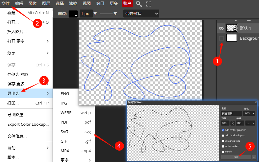
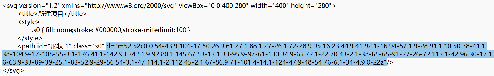
6、找到導出的 SVG ,用記事本打開,path 標簽中的 d 屬性就是路徑的坐標值。
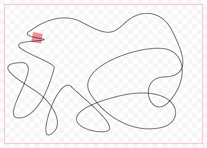
使用路徑做路徑動畫
注意:本示例中為了看到運動路徑,將 SVG 的代碼也放在了代碼中,實際無需 SVG 代碼,僅需要 path 中的路徑參數即可!
<div class="box">
  <div class="item"></div>
  <svg class="svg" version="1.2" xmlns="http://www.w3.org/2000/svg" viewBox="0 0 400 280" width="400" height="280">
    <path stroke="#000000" fill="none" d="m52 52c0 0 54-43.9 104-17 50 26.9 61 27.1 88 1 27-26.1 72-28.9 95 16 23 44.9 41 92.1-16 94-57 1.9-28 91.1 10 50 38-41.1 38-104.9-17-108-55-3.1-176 41.1-142 93 34 51.9 92 80.1 145 67 53-13.1 33-95.9-97-61-130 34.9-65 72.1-22 70 43-2.1-38-65-65-91-27-26-72 113.1-42 96 30-17.1 6-63.9-33-89-39-25.1-83-52.9-29-56 54-3.1-47 114.1-2 112 45-2.1 67-86.9 71-101 4-14.1-124-47.9-48-54 76-6.1-34-4.9 0-22z"/>
  </svg>
</div>
<style>
.box {
  width: 400px;
  height: 280px;
  border: 2px solid rgba(255, 71, 87, 0.3);
  position: relative;
}
.svg {
  position: absolute;
  left: 0;
  top: 0;
}
@keyframes offset-ani {
  0% {
    offset-distance: 0%;
  }
  100% {
    offset-distance: 100%;
  }
}
.item {
  animation: offset-ani 10s infinite linear;
  width: 20px;
  height: 20px;
  background-color: rgba(255, 71, 87,0.6);
  offset-path: path("m52 52c0 0 54-43.9 104-17 50 26.9 61 27.1 88 1 27-26.1 72-28.9 95 16 23 44.9 41 92.1-16 94-57 1.9-28 91.1 10 50 38-41.1 38-104.9-17-108-55-3.1-176 41.1-142 93 34 51.9 92 80.1 145 67 53-13.1 33-95.9-97-61-130 34.9-65 72.1-22 70 43-2.1-38-65-65-91-27-26-72 113.1-42 96 30-17.1 6-63.9-33-89-39-25.1-83-52.9-29-56 54-3.1-47 114.1-2 112 45-2.1 67-86.9 71-101 4-14.1-124-47.9-48-54 76-6.1-34-4.9 0-22z");
}
</style>
效果:
寫在最后
路徑動畫讓 CSS 在動畫領域擁有了更多創造性,雖然還有一些新的特性在瀏覽器中的兼容不太理想,但未來可期~~
轉自https://www.cnblogs.com/linx/p/18870562
該文章在 2025/5/13 11:14:37 編輯過


 400 186 1886